Quarter 6 – April 2015 update

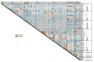
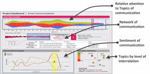
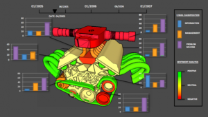
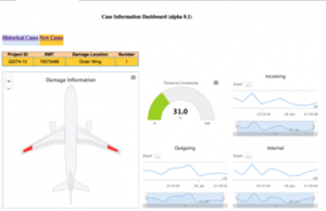
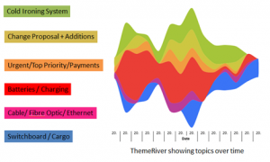
Over the last quarter we have been consolidating our analysis, with the aim of grouping analyses into prototype dashboards for communications, records and representations (such as CAD). Further work has been completed to finalise the full range of project features associated with the concept of engineering project health monitoring. We have now identified 85 features (proxies) for engineering Project Health Monitoring (ePHM) and started work on validating these, and ranking their relative importance for engineering project health.

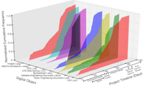
Due to the number of features, this is proving quite a time consuming task – here is a small sample of the matrix!

Q6-April-2015

Faculty of Engineering Industry Showcase

April 13th saw the University of Bristol host its Faculty of Engineering Industry Showcase Event which was attended by over 100 of the University’s industrial partners.

Our posters: [gview file=”https://locm.blogs.bristol.ac.uk/files/2016/05/LOCM-Posters-Industry-Showcase.pdf”] Continue reading “Faculty of Engineering Industry Showcase”

Quarter 5 – January 2015 update

The major focus of our research effort has been on the acquisition of further datasets, preparation of prototype dashboards (vision demonstrators) and preparation of conference papers.

For example, here is a new composite of various analyses:

Q5-Jan-2015

We’re also pleased to report that a total of five conference papers were accepted for presentation at the prestigious International Conference on Engineering Design (http://iced2015.org/), to be held in Milan in July. Details of these papers may be found in our publications section. We are also pleased to announce that RWA have now joined the project.

Quarter 4 – October 2014 update

Following the Project Advisory Group meeting of our industrial partners in the summer, and further feedback from industrial partners, the focus of research has been on the following areas: the configuration of prototype project dashboards and the development of the concept of engineering project health monitoring, and in particular, the proxies of performance of engineering projects – i.e. features of interest for project stakeholders. To address the latter a series of ethnographic studies are to be undertaken.

Below are some examples of composites of various analyses we are now able to undertake.  Here we are mapping sentiment and type of email being sent onto a representation of a product – who is saying what about each part of the product?  This could give project managers valuable early warning about potential issues:

Q4-October-2014-1

Similarly, this example dashboard shows various information about aircraft repairs, using a visual representation of the aircraft and damage location:

Q4-October-2014-2

Quarter 2 – March 2014 update

Based on a review of extant research combined with scoping of datasets digital assets are to be split into three types (communications, records and representations) and four classes of attribute (physical, content, context, and semantic). A series of scoping studies are being undertaken around communication in a large systems engineering project, the digital assets associated with a Formula Student project and the workflow of an in-service repair and maintenance department.

We’ve also begun exploring visualisations of the outputs – here is a ‘theme river’ showing how various key topics from a project wax and wane over the lifetime of a project – all extracted automatically:

Q2-March-2014

And here is an example of an automatic analysis of how terms used in a project are related to each other – this could be used to help uncover hidden dependencies, for example:

Q2-March-2014-2

Quarter 1 2013 update

Since the project kick-off meeting in September the project team has focused on four interrelated areas. These are: understanding extant research, developing a data management plan, initial exploratory studies, and developing analytic capability including the use, modification and creation of tools (code) and associated methods, such as semantic analysis.

For example, this graph shows the evolution of various types of digital object over the life of a project.  It looks pretty, but what we can tell from this? Does a ‘good’ project and a ‘bad’ project look the same?

Q1-2013

What’s interesting about this anyway?

Well it turns out that (thankfully) there is quite a lot that is interesting! September saw us host our Industrial partners at the University of Bath for a kick-off session to help shape the programme.

Two questions were posed, the first around expectations or current pain points, and what our partners were hoping to get out of the project.  There was a huge range of responses, such as:

  • Moving away from phase-gate – stage-gate often too late
  • Formalising the dynamic design process (awareness)
  • Making sense of the ‘fog of war’
  • Monitoring team collaboration/divergence – ‘alignment of activities’
  • Is there a ‘stable design’ anymore?
  • Knowledge modelling – re-use of knowledge/information

Continue reading “What’s interesting about this anyway?”